Sometimes I use a dark theme in notebooks, email, and slack to reduce eyestrain. I’m probably not the only one who needs this mode to get through the day. A common problem is that some plots don’t show up right. This is accessibility issue which is is very easy to fix.
Issue Description
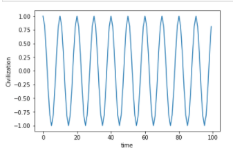
Using the default output from matplotlib, plots look like this in slack and jupyter “dark mode”.

Seen against a white background
Solution
The problem is that the default image format output by matplotlib is a png with no background color fill outside the axis.
There are a few ways to fix this:
Option #1, Make the background color be white
#Include the following in your import lines
import matplotlib.pyplot as plt
plt.rcParams['figure.facecolor']='w'
plt.rcParams['savefig.facecolor']='w'
Fix #2, Change the default output format from png
%matplotlib inline
import matplotlib.pyplot as plt
from IPython.display import set_matplotlib_formats
set_matplotlib_formats('jpg')
Fix #3, Take a screen shot!
This is what I do. Select area to clipboard, paste into whatever. Guaranteed WYSIWYG.
- Mac: CMD-Ctrl-Shift-4
- Windows: Windows-Shift-S
- Ubuntu: Ctrl-Shift-Prtscr (Requires full keyboard. Smaller keyboards can be done by remapping the key.)